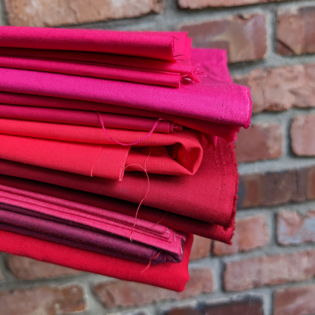
Keeping with tradition, I set out to see if I could find a reasonably close fabric match to this year's Pantone Color of the Year, Viva Magenta. With Sarah @saroy and Elizabeth @elizabethkray co-hosting the 2023 Pantone Quilt Challenge, I definetely had plenty of incentive. But let's just say this year is proving to be one of the most difficult ones yet!
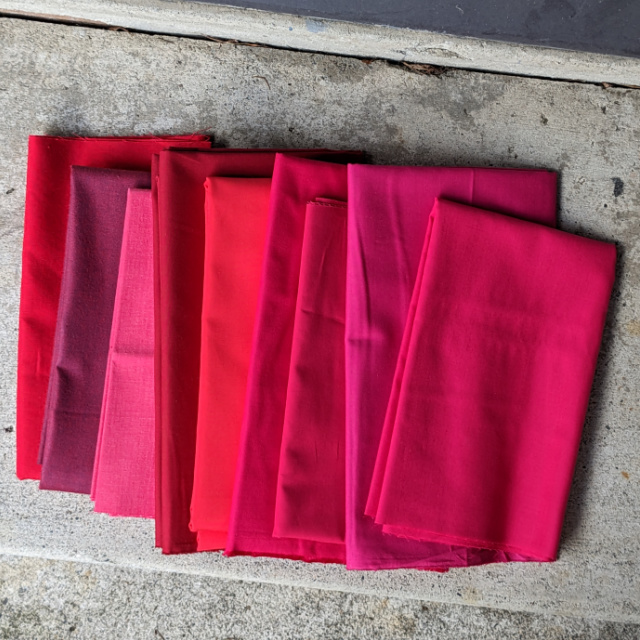
Here were my candidates (L-R):
Essex Crimson
Peppered Cotton Garnet
Alison Glass' Kaleidoscope Strawberry
Kona Wine
Kona Crush
Kona Pomegranate
Pure Solids Dragonfruit
Cotton Couture Fuchsia
Painter's Palette Raspberry
Note that the first three - Essex, Peppered Cotton, and Kaleidoscope - were ordered purely as different substrate options to quilter's cotton, which I sometimes enjoy including in a project like this. Ordered purely due to the color they appeared on screen when ordering and/or their name, none are even close matches to Viva Magenta. But the Kaleidoscope especially could prove to be an interesting contrast to include. We'll see.
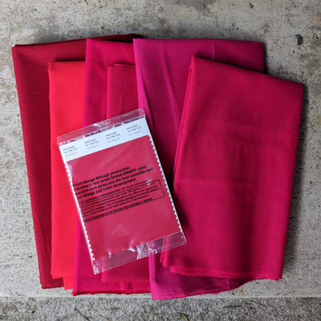
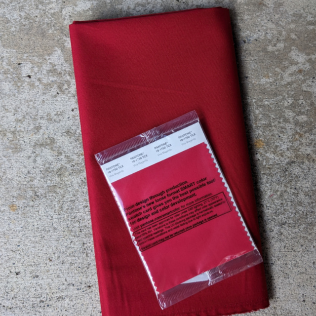
So that left the six solids shown below with the official Pantone color card, in the same order as the photo above. Thanks again to my daughter Rachel @snippetsofsweetness for ordering the swatch cards for us. We really enjoy having the actual swatch to compare to.

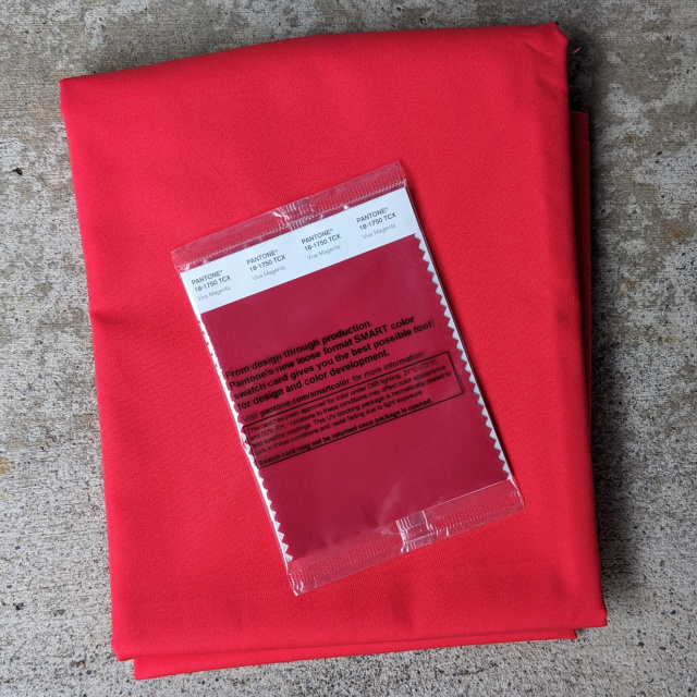
.jpg)
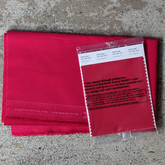
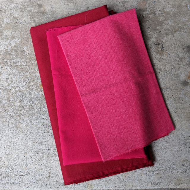
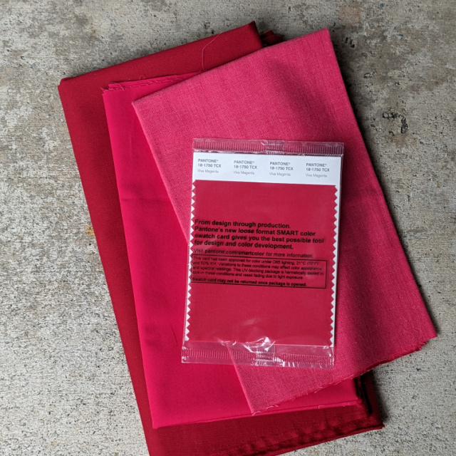
I love all of them and can't wait to see what you create!
ReplyDeleteI think reds can be really tricky to match and get right. Looks like you've done a pretty thorough search and found a really close match. I do like the trio together and look forward to what you make for the challenge!
ReplyDeleteI think it's so interesting that Kona Crush was part of the mix, since I don't think it fits at all. Quite the variety of fabrics, but I agree with your choice. I do like that trio you are considering, as well.
ReplyDeleteFun with Shades of Magenta!
ReplyDeleteI always appreciate the effort you and Rachel put into researching this. Though I know that even your posted photos might not give an accurate color representation on my computer, it looks like that Pure Solids Dragonfruit is the closest to Viva Magenta. Just a thought... would Spoonflower be able to reproduce an exact match? I love your pretty trio of Viva Magenta values, and am certain they'll look great together in a quilt. Now I'm curious... what are you doing for design inspiration? When design is "wide open," i get so overwhelmed, I'm stymied. But give me parameters and I seem to work better. How are you going about your piece?
ReplyDelete