Even though the current Quilt Improv Studio POP Improv Challege guidelines specificially said that we didn't need to create something really similar to Pop Art, I knew I wanted to try, with my first thought being of Andy Warhol's Campbell's Soup Cans. But, of course, not that. Merriam-Webster defines pop art as "art in which commonplace objects are used as subject matter." With that in mind, I chose the lowly fork, an eating utensil we use daily, and I bet you do too.
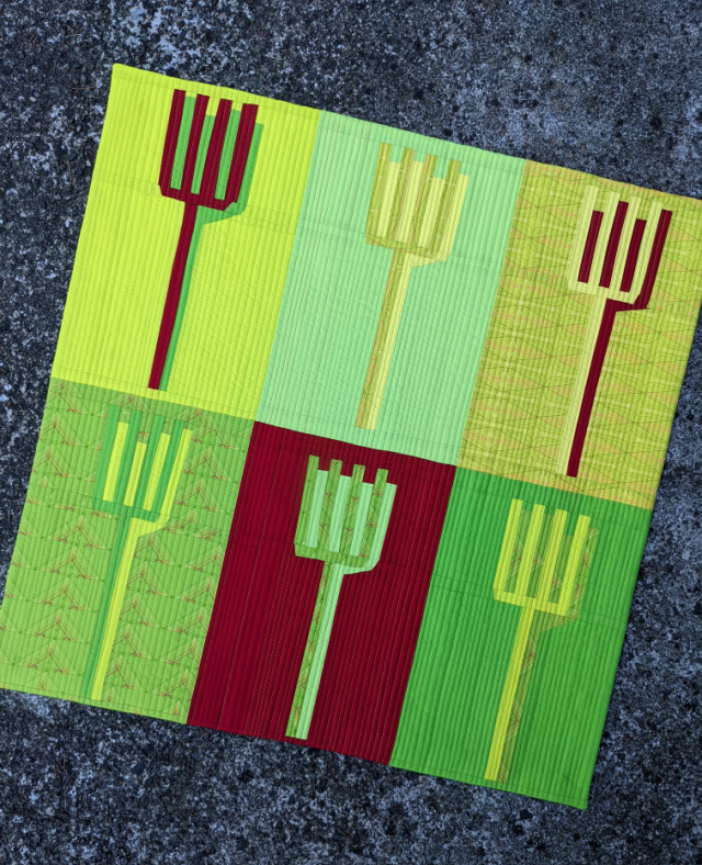
I definitely wanted to let the 'pop' theme also speak through the fabrics I used. As I mentioned in my July Fabric Usage post, I used the self-curated bundle shown below with the later addition of Kona Rich Red. See that red bit in the green print second from the bottom? That's what confirmed the addition of the red. The overall palette is unique, I agree, but it was fun to work with, kept with my continuing use of Rich Red, and was kind of unexpected. All reason enough for me.
And then, I set to trying to create improvisationally-pieced forks. Let's just say my first attempt wasn't that great. By the way, the first two blocks were about 9" square.
My friend, Louise/
@imfeelincrafty gently suggested that including a shadow or outline might improv things, and they definitely did.
The new blocks were 10.5" x 15.5", a much better size. I wasn't 100% happy, though, and kept obsessing about that section on the right where the corner of the fork's shadow was. I finally settled on a rough method, reconfigured the most grievous one, and just let the rest be what they were as I created them. They ended up with a pretty similar look, but not quite identical. That's improv for you. But finally I had a set of six that I was fairly happy with.
Is it bad to say that one of my favorite things about this piece is the chair print I found to include on the back? It's by
Laurie Wisbrun, and I've been hanging onto it for a very long time. I thought it was perfect for the eating theme of this little (30" x 30") quilt, and honestly, gave me renewed energy to get this one finished.
I went with straight-line quilting at 1/4" intervals using a randomly-placed handful of
Aurifil 50wt threads - #2115 [Lemon], #2120 [Canary], #1231 [Spring Green], #1114 [Grass Green], and #2250 [Red]. Then I finished it all off with a faced binding.
So was my foray into pop art quilting a success? That's debatable. But it was definitely fun to give it a try! If you want to see how my take on the
QIS Pop Improv theme compared to the other challengers, check out the
#qispopimprov hashtag.


The shadows add a nice depth and dimension to the forks. I also can see pitch forks which make me think of American Gothic. Do you have any particular plans for this mini?
ReplyDeleteWonderful piece, so rich colors :-)
ReplyDeleteThis would be such a fun quilt to hang in a kitchen or dining area, I think! I love the colors, the addition of the red was spot on. I think you did a great job on the improv piecing of the forks!
ReplyDeleteI think it is awesome! xo
ReplyDeleteI love it! I think it's a very successful piece of improv pop art! And I love that backing print too - "Tufted Tweets"? I have a tiny piece left too ...
ReplyDeleteAbsolutely love it!
ReplyDelete