Scraps. Minimalism. Very Peri, the Pantone Color of the Year. Fabric Play. They all came together in this piece. I hadn't necessarily planned on such a small work (20" x 20.5") for my personal Pantone challenge this year; but when the urge struck, and I realized I only had a half yard of my chosen Peri fabric, I just went for it.
Months ago I had chosen Cotton Couture Crocus as a good match for Very Peri, and rather than cut it into bits, I opted to keep my piece of it in large chunks. I was inspired by a minimalist Canadian Red Cross quilt in Cassandra Ellis' World of Quilts: Reinterpreting Quilting Heritage from Around the Globe. I took Cassandra's advice to "Use any scraps that you have for the 'crazy' cross and enjoy making something beautiful out of very little." So for my cross, I used a handful of red scraps, print and solid, including a small portion of Kona Rich Red.
Just for fun - and since I forgot my plan on my recent Italiano antico - I had trimmed the piece at an angle.

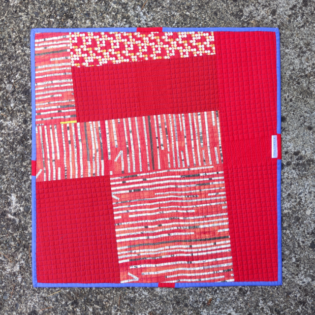
The back was simply pieced using more scraps.
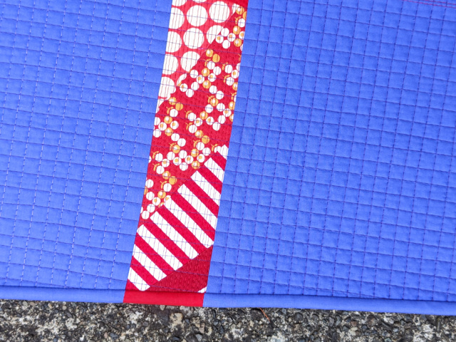
And then I finished things up with some matched binding in Cotton Couture Crocus and Cherry. I still say that Angled Matched Binding is 150% more tricky than Straight Matched Binding; so yes, I had to refer to my own tutorial.


I can definitely see the subtle change in the quilting based on the light and dark elements, and the matched binding really finishes it off beautifully (and I had thought to myself: oof, that would take me some time to work out those angles)!
ReplyDeleteI absolutely love that!!!
ReplyDeleteYou DO know how to have creative fun, and always make stuff that looks "just right." That color combo is one I never would have thought to try, let alone actually DO, but as ever, you knew exactly what would work. Love that scrappy piecing that creates so much interest against the funky-colored background. This is definitely a winner in my book!
ReplyDeleteWhat a cute piece! Love the matching binding, the matchstick quilting and the scrappy back. How do you get your binding so small and precise- it is amazing!
ReplyDeleteSo many really cool details in such a small piece. Well done.
ReplyDeleteThis is wonderful! At first glance I thought you had used a different periwinkle fabric against the cross so I was amazed to realize that the thread and different width of quilting had actually made that color change to my eyes. I feel sometimes less is more and this definitely is one of those pieces!
ReplyDeleteI love your wonky and scrappy cross. And or some reason the color combination makes sense here - not sure I would ever pick somthing like this myself ;) Enjoy your fun finish and fabric play! xo
ReplyDelete