Showing posts with label Very Peri. Show all posts

Tuesday, September 20, 2022

Red Cross Meets Very Peri

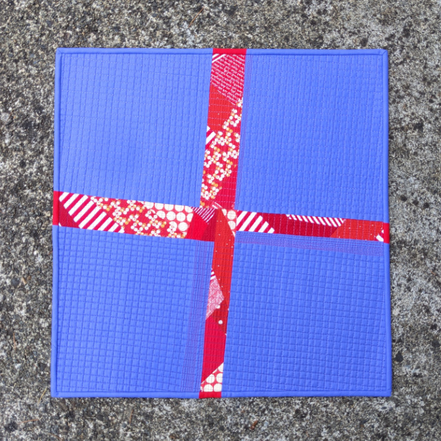
Scraps. Minimalism. Very Peri, the Pantone Color of the Year. Fabric Play. They all came together in this piece. I hadn't necessarily planned on such a small work (20" x 20.5") for my personal Pantone challenge this year; but when the urge struck, and I realized I only had a half yard of my chosen Peri fabric, I just went for it.

Months ago I had chosen Cotton Couture Crocus as a good match for Very Peri, and rather than cut it into bits, I opted to keep my piece of it in large chunks. I was inspired by a minimalist Canadian Red Cross quilt in Cassandra Ellis' World of Quilts: Reinterpreting Quilting Heritage from Around the Globe. I took Cassandra's advice to "Use any scraps that you have for the 'crazy' cross and enjoy making something beautiful out of very little." So for my cross, I used a handful of red scraps, print and solid, including a small portion of Kona Rich Red.


The quilt was pieced 'straight,' with quilting done in three Aurifil 50wt threads. I started with matchstick-quilting the cross with Aurifil 50wt 2250 [Red]. The bars of the cross weren't all the same widths, but with the quilting, I pretended they were. Then for the periwinkle sections, I used two Aurifil 50wt threads 2520 [Violet] and 4225 [Eggplant]. After attending a trunk show with Audrey Esarey/@cottonandbourbon recently, I loved her way of incorporating thread color as a design feature, and I experimented here by using the lighter thread horizontally in the top half and vertically in the right half; and the darker thread horizontally in the bottom half and vertically in the left half. Does that even make sense? The crosshatch measures 3/8" between each line. Can you see the result of the different threads? 

Just for fun - and since I forgot my plan on my recent Italiano antico - I had trimmed the piece at an angle.

The back was simply pieced using more scraps. 

And then I finished things up with some matched binding in Cotton Couture Crocus and Cherry. I still say that Angled Matched Binding is 150% more tricky than Straight Matched Binding; so yes, I had to refer to my own tutorial.


Simple as it was, I really enjoyed making this one. It was the kind of creative fun this quilting thing should be.

Thursday, April 7, 2022

My Very Peri

Ever since we began paying attention to the Pantone Color of the Yearmy daughter, Rachel/@snippetsofsweetness, has ordered us official Pantone Color of the Year swatch cards, so when it came time to find a fabric match for this year's Very Peri, it was the swatch that I consulted.


Here's what I ordered to see in person:

[Note that I also consulted color cards for PBS Fabrics' Painter's Palette Solids and RJR Cotton Supreme Solids, but neither had a color close to a match.]


Once I received the fabric, it was clear right off that the Cotton Couture Periwinkle and AMB Dark Periwinkle weren't matches. So that left three others to consider (left to right below) - Kona Noble Purple, Cotton Couture Crocus, and Kona Amethyst.


So from my viewpoint, Kona Noble Purple is a tad dark; and Kona Amethyst, though close, is a tad too light. But if you're a Kona fan, either would be a reasonable choice. The closest match for me, though, from those I compared, is Cotton Couture Crocus.


A project from these colors is definitely in order, so one of these days! Are you planning a Very Peri project? If so, what fabric or palette will you choose?

Thursday, December 9, 2021

Very Peri

It's here! The Pantone Color of the Year 2022 was announced yesterday. Meet Very Peri!

Personally, I kinda love it! "A new Pantone color whose courageous presence encourages personal inventiveness and creativity." Wow. That sure sounds promising, doesn't it? AND "For the first time in Pantone’s history, [it] has dreamt up a brand-new shade for its 2022 color of the year selection." I kinda like that too. I'll be dabbling with Very Peri in the new year for sure.

Keeping with tradition, this will be my 11th(!) year creating with the Pantone COTY. Here's a review of my previous Pantone-inspired creations....

:: Ultimate Gray and Illuminating 2021 :: "Some Like It Medium"

:: Classic Blue 2020 :: "Utterly Blue"

:: Living Coral 2019 :: "Timeless"

:: Ultra Violet 2018 :: "Grape Fizzy"

:: Greenery 2017 :: "Evergreenery"

:: Rose Quartz and Serenity 2016 :: "Pantone Meets Bias Tape"

:: Marsala 2015 :: "Sizzling"


:: Emerald 2013 :: "An Emerald Table"

:: Tangerine Tango 2012 :: "Tangerisk"

Meanwhile, there's plenty being written about the new color. Let me know what you think!